Monday, April 19, 2010
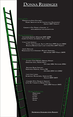
Resume

Wednesday, April 7, 2010
"Promise" Logo

Meeko Sketch

Architectural Detail Sketch

This sketch is a close up of a “door knocker.” My goal was to make the item standout on a dark background. Color pencil was the perfect media for this project. The colors chosen are from my high school “Shorecrest High School,” the paper color is a darker green. I used yellow as the main fixture color and the white for detailing.
Sunday, March 28, 2010
Leaf Variety Sketch

Leaf Variety Sketch" is a random assortment that uses a variety of drawing methods to help show each leaf's originality. This particular view is a section of a larger picture. It was chosen purposely because it shows the most detail and does the best job of drawing the eye.
Mountain "Scene" Sketch

Mountain “Scene” Sketch is one of my favorite pieces. It was spontaneous and followed its own guidelines. It reflects a few of my loves in life, nature and creativity. An artistic feature that I like is the balance of color throughout the whole scene. The simplicity of the sketch makes the message all the more important and direct.
When I look at it, I wish I could stand among those mountains surrounded in my own world. This sketch reminds me of reality, everything doesn’t need to be complicated, just take a breath and immerse yourself in your own world. This is my getaway . . .
Wednesday, March 24, 2010
"Unrecognizable" Quilt Pattern

“Unrecognizable” Quilt Pattern was a fun and intriguing project. It is a design of many different pictures pieced together to become a decorative quilt. There is a catch, each picture put into place in this creative puzzle used to be something completely different. If you look closely you may be able to tell what the picture began as, I highly doubt that however. One picture used to be a waterfall and rocks, another a forest and another a galaxy. The title is Unrecognizable; see if you can figure out what each was originally.
Heritage Textile Pattern

Heritage Textile Pattern is a creation I put together to help illustrate where I came from. A lot of time, research and emotion went into making this project. To help explain the final design to new comers, I am mostly German. The color red, black and yellow are those of the German flag. In the center sits my family crest with our motto slightly lower and to the right; “Virtus Semper Virdis” which means “virtue is always flourishing.” In the four corners is the Neuschwanstein Castle, the castle that Cinderella’s Castle was designed from. Finally in the very back are a few strands of barbed wire, a connection to my Jewish ancestry. It may not be the brightest past with the best memories but its still part of my past that needs to be recognized. I am very proud of my project and my past.
Tuesday, March 23, 2010
Keys Sketch
.jpg)
“Key Sketch” does a good job of showing the improvement of my art skills. When compared to “Leaf Variety Sketch” it is obvious which sketch was done earlier. I am very proud of this sketch because it shows several developed skills such as texture, proportion, shading, proper angle and item accuracy. Concurrently this is my key chain, which adds a sense of me to the sketch. The objects on the keychain do the best job of reflecting its owner in the art, therefore the accuracy or inaccuracy is the most important aspect.
